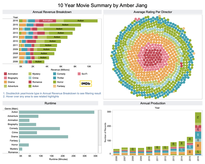
Tableau tips: Build Advanced Tableau charts just in a few seconds…

All in one blog… save your time…Happy Reporting!!!
Further to my last blog
I am writing the new blog to have something like cheese on bread… I mean this contains some advanced charts as well as more expensive visuals can be created in quickly manner and easy way to remember the way they are getting build.
So, apart from some simple charts, we can build more interactive and automated visuals to handle your dashboard easily.
- Waffle chart to show composition as well as comparison of data.
2. Profit vs Sales with automated KPIs on monthly basis in Tableau
3. Create a Tornado chart or butterfly chart to compare profit vs sales
4. How to display KPIs next to bars in a bar chart
Invest just a few seconds…
5. Highlight filter on sparklines to make automated labels in chart in just a minute.
6. The orbital chart in Tableau/ Advanced donut chart in Tableau just in 4–5 mins
Happy Learning!!
Thank you!
